
2019
Dynamic Composite Data Physicalization Using Wheeled Micro-Robots
Mathieu Le Goc, Charles Perin, Sean Follmer, Jean-Daniel Fekete, Pierre Dragicevic
IEEE Transactions on Visualization and Computer Graphics (TVCG / Proc. of Infovis '18). IEEE
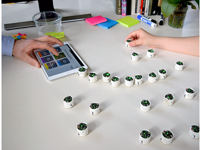
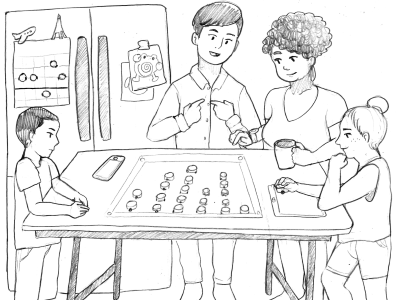
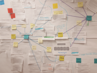
This paper introduces dynamic composite physicalizations, a new class of physical visualizations that use collections of self-propelled objects to represent data. Dynamic composite physicalizations can be used both to give physical form to well-known interactive visualization techniques, and to explore new visualizations and interaction paradigms. We first propose a design space characterizing composite physicalizations based on previous work in the fields of Information Visualization and Human Computer Interaction. We illustrate dynamic composite physicalizations in two scenarios demonstrating potential benefits for collaboration and decision making, as well as new opportunities for physical interaction. We then describe our implementation using wheeled micro-robots capable of locating themselves and sensing user input, before discussing limitations and opportunities for future work.
2018
WWI00 {World War One Hundred}
Johannes Liem, Eirini Goudarouli, Steven Hirschon, Jo Wood, Charles Perin
IEEE VIS 2018 Arts Program demonstrations, Berlin, Germany. IEEE
Together with The National Archives UK, we have been looking into how visualization can help convey the uncertainty in historical digital records. We have developed GeoBlob, an abstract representation of spatio-temporal data dedicated to conveying uncertain positions and uncertain temporal information of entities that move over time; using hand-written war diaries from World War One as our case study.
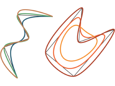
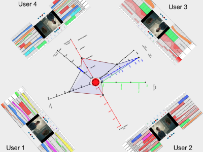
The Symmetry of My Life II
Charles Perin
IEEE VIS 2018 Electronic Conference Proceedings, Berlin, Germany. IEEE
Personal data is increasingly seen as a political and economic weapon, used by evil industries against the will of individuals. But personal data is also a resource of great value as it provides a medium to reminisce, to reflect and to share personal stories that shape our identities. I explore with this visualization design the peculiarities of visualizing personal data for the purpose of private reminiscing and public sharing.
Cycles and (A)Symmetry | Exploring the Design of Shareable Personal Visualizations
Charles Perin
IEEE VIS 2018 Arts Program Annotated Portfolios, Berlin, Germany. IEEE
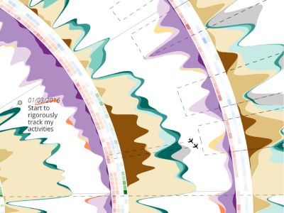
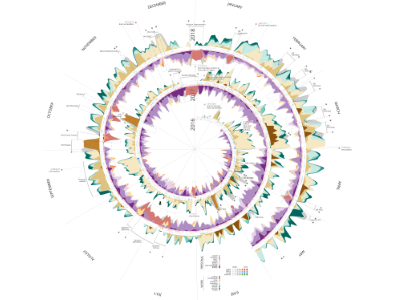
In this project, I explore the process of designing a relatable, aesthetically pleasing, intriguing visualization; a visualization that is as personal as the data it represents; and a visualization whose purpose is to support the telling of personal stories; from telling stories to a semi-private audience like colleagues at a conference to telling more intimate stories to close relatives who might have shared some moments of my life.The data I collected for this project consists of work-related data and personal data. The backbone of this visualization is the manual activities I logged for the past two years and a half. To log my activities, I used the Toggl application. The application consists of a simple timer that makes it possible to record activities in real time activities and to associate to each activity a description and a category.
Conveying Uncertainty in Archived War Diaries with GeoBlobs
Johannes Liem, Eirini Goudarouli, Steven Hirschon, Jo Wood, Charles Perin
IEEE VIS 2018 Electronic Conference Proceedings, Berlin, Germany. IEEE
Since 2014, The National Archives (UK) have been digitizing analog, hand-written War Diaries from the First World War (WWI), documenting the story of the British Army and its units on the Western Front. Using the crowdsourcing platform Operation War Diary (OWD), 'citizen historians' tag 1.5 million scanned and archived pages. They classified and annotated essential information on each diary page, generating extensive time-series data about military units, including labels for casualties, unit strength, weather, everyday army life, military activities, soldier names and ranks, location names and dates.
Embedded Personal Physicalizations
Mathieu Le Goc, Charles Perin, Sean Follmer, Jean-Daniel Fekete, Pierre Dragicevic
Proceedings of the IEEE VIS 2013 workshop: Toward a Design Language for Data Physicalization, Berlin, Germany
With the emergence of quantified-self, smart devices, Internet of Things and ubiquitous robotics, we envision new opportunities to create dynamic embedded physicalizations. In particular, we see new challenges arising in the context of personal and casual physicalizations at home. In this paper, we discuss the research directions and potential benefits of dynamic embedded physicalizations in the residential context, or Embedded Personal Physicalizations.
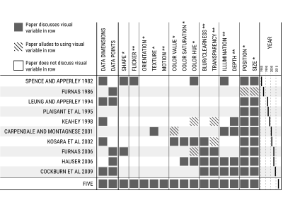
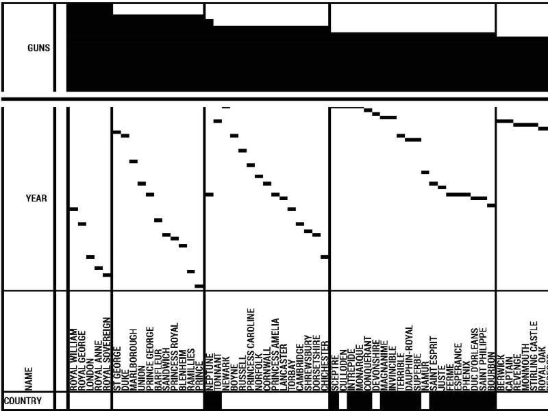
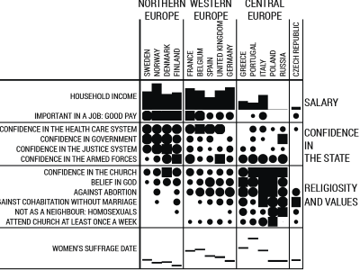
Jacques Bertin’s Legacy in Information Visualization and the Reorderable Matrix
Charles Perin, Jean-Daniel Fekete, Pierre Dragicevic
Cartography and Geographic Information Science. Taylor & Francis
Jacques Bertin's legacy extends beyond the domain of cartography, and in particular to the field of information visualization where he continues to inspire researchers and practitioners. Although in the late 20st century his books were out of print, their re-edition around 2010 has steered a renewed interest and inspired new generations of researchers to re-interpret the principles of Semiology of Graphics and La Graphique in a time of interactive computers. In particular, the work of Jacques Bertin on the reorderable matrix has been very challenging in his time, and the quest to its automation has not been satisfactory to him. This article summarizes Bertin’s approach to the reorderable matrix, underlines the limitations of fully automated reordering methods, and introduces Bertifier, a hybrid system to reorder matrices using a combination of machine assistance and human control.
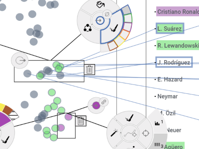
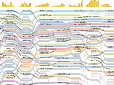
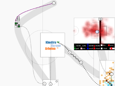
State of the Art of Sports Data Visualization
Charles Perin, Romain Vuillemot, Charles Stolper, John Stasko, Jo Wood, Sheelagh Carpendale
Computer Graphics Forum (CGF / Proc. of Eurovis '18 STAR reports). The Eurographics Association & John Wiley & Sons, Ltd
We organize and reflect on recent advances and challenges in the field of sports data visualization. The exponentially-growing body of visualization research based on sports data is a prime indication of the importance and timeliness of this report. Sports data visualization research encompasses the breadth of visualization tasks and goals: exploring the design of new visualization techniques; adapting existing visualizations to a novel domain; and conducting design studies and evaluations in close collaboration with experts, including practitioners, enthusiasts, and journalists. Frequently this research has impact beyond sports in both academia and in industry because it is i) grounded in realistic, highly heterogeneous data, ii) applied to real-world problems, and iii) designed in close collaboration with domain experts. In this report, we analyze current research contributions through the lens of three categories of sports data: box score data (data containing statistical summaries of a sport event such as a game), tracking data (data about in-game actions and trajectories), and meta-data (data about the sport and its participants but not necessarily a given game). We conclude this report with a high-level discussion of sports visualization research informed by our analysis—identifying critical research gaps and valuable opportunities for the visualization community.
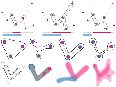
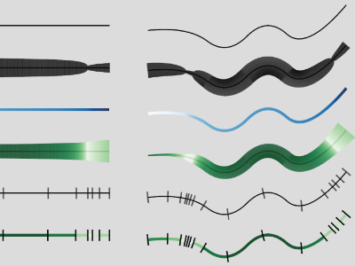
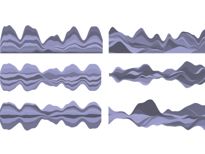
Ways of Visualizing Data on Curves
Benjamin Bach, Qiuyuan Ren, Charles Perin, Pierre Dragicevic
TransImage 2018 - 5th Biennial Transdisciplinary Imaging Conference
This paper reviews the many ways curves are used to encode data in information visualization. As part of our review, we introduce a curve-based visualization framework where data can be encoded in two major ways: i) through a curve’s shape (a process we call embedding) and ii) through a curve’s local visual attributes (a process we call enrichment). Our framework helps describing and organizing the rich design space of curve-based data visualizations, and offer inspiration for novel data visualizations.
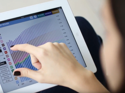
Democratizing Open Energy Data for Public Discourse using Visualization
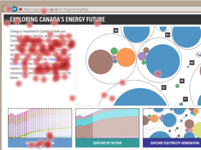
Soren Knudsen, Jo Vermeulen, Doris Kominsky, Jagoda Walny, Mieka West, Christian Frisson, Bon Adriel Aseniero, Lindsay MacDonald, Charles Perin, Lien Quach, Peter Buk, Katrina Tabuli, Shreya Chopra, Wesley Willett, Sheelagh Carpendale
Extended Abstracts of the 2018 CHI Conference on Human Factors in Computing Systems. ACM
In December 2016 the National Energy Board of Canada (NEB) was awarded a Regulatory Excellence Award in the category 'Contribution to Innovation in the Regulatory Field' for the Energy Futures visualizations. I was leading the design team at the University of Calgary that designed these interactive visualizations to make the NEB's Energy Futures data accessible to the general public. The award was granted to the NEB by the Community of Federal Regulators at the Regulatory Excellence Awards ceremony in Ottawa.
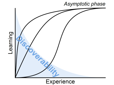
Exploration Strategies for Discovery of Interactivity in Visualizations
Tanja Blascheck, Lindsay MacDonald, Jo Vermeulen, Charles Perin, Wesley Willett, Thomas Ertl, Sheelagh Carpendale
IEEE Transactions on Visualization and Computer Graphics (TVCG). IEEE
We used the interactive visualizations we designed to investigate the discovery of the functionality of an interactive visualization designed for the general public. While interactive visualizations are increasingly available for public use, we still know little about how the general public investigates and discovers what they can do with these visualizations. Understanding the discovery process allows to develop better interfaces for the general public and make data more accessible to them. To unpack this problem, we analyzed the results of a lab study where participants discovered the functionality of a connected set of visualizations of public energy data. We collected eye tracking data and interaction logs, as well as video and audio recordings. By integrating this quantitative and qualitative data, we extracted five exploration strategies employed by participants to discover the functionality in these interactive visualizations. These exploration strategies illuminate possible design directions for future interactive visualization.
Assessing the Graphical Perception of Time and Speed on 2D+Time Trajectories
Charles Perin, Tiffany Wun, Richard Pusch, Sheelagh Carpendale
IEEE Transactions on Visualization and Computer Graphics (TVCG / Proc. of Infovis '17). IEEE
We empirically evaluate the extent to which people perceive non-constant time and speed encoded on 2D paths. In our graphical perception study, we evaluate nine encodings from the literature for both straight and curved paths. Visualizing time and speed information is a challenge when the x and y axes already encode other data dimensions, for example when plotting a trip on a map. This is particularly true in disciplines such as time-geography and movement analytics that often require visualizing spatio-temporal trajectories. A common approach is to use 2D+time trajectories, which are 2D paths for which time is an additional dimension. However, there are currently no guidelines regarding how to represent time and speed on such paths. Our study results provide InfoVis designers with clear guidance regarding which encodings to use and which ones to avoid; in particular, we suggest using color value to encode speed and segment length to encode time whenever possible.
MyBrush: Brushing and Linking with Personal Agency
Philipp Koytek, Charles Perin, Jo Vermeulen, Elisabeth Andre, Sheelagh Carpendale
IEEE Transactions on Visualization and Computer Graphics (TVCG / Proc. of Infovis '17). IEEE
We extend the popular brushing and linking technique by incorporating personal agency in the interaction. We map existing research related to brushing and linking into a design space that deconstructs the interaction technique into three components: source (what is being brushed), link (the expression of relationship between source and target), and target (what is revealed as related to the source). Using this design space, we created MyBrush, a unified interface that offers personal agency over brushing and linking by giving people the flexibility to configure the source, link, and target of multiple brushes. The results of three focus groups demonstrate that people with different backgrounds leveraged personal agency in different ways, including performing complex tasks and showing links explicitly. We reflect on these results, paving the way for future research on the role of personal agency in information visualization.
Active Reading of Visualizations
Jagoda Walny, Samuel Huron, Charles Perin, Tiffany Wun, Richard Pusch, Sheelagh Carpendale
IEEE Transactions on Visualization and Computer Graphics (TVCG / Proc. of Infovis '17). IEEE
We investigate whether the notion of active reading for text might be usefully applied to visualizations. Through a qualitative study we explored whether people apply observable active reading techniques when reading paper-based node-link visualizations. Participants used a range of physical actions while reading, and from these we synthesized an initial set of active reading techniques for visualizations. To learn more about the potential impact such techniques may have on visualization reading, we implemented support for one type of physical action from our observations (making freeform marks) in an interactive node-link visualization. Results from our quantitative study of this implementation show that interactive support for active reading techniques can improve the accuracy of performing low-level visualization tasks. Together, our studies suggest that the active reading space is ripe for research exploration within visualization and can lead to new interactions that make for a more flexible and effective visualization reading experience.
2017
The Symmetry of My Life: An Autobiographical Visualization
Charles Perin
IEEE VIS 2017 Electronic Conference Proceedings, Phoenix, AZ, USA. IEEE
In this project, I explore the process of designing a relatable, aesthetically pleasing, intriguing visualization; a visualization that is as personal as the data it represents; and a visualization whose purpose is to support the telling of personal stories; from telling stories to a semi-private audience like colleagues at a conference to telling more intimate stories to close relatives who might have shared some moments of my life. The data I collected for this project consists of work-related data and personal data. The backbone of this visualization is the manual activities I logged for the past two years and a half. To log my activities, I used the Toggl application. The application consists of a simple timer that makes it possible to record activities in real time activities and to associate to each activity a description and a category.
Differences That Matter: In-Clinic Communication Challenges
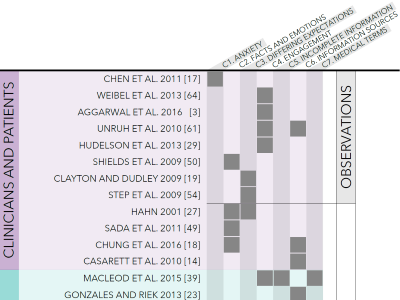
Fateme Rajabiyazdi, Charles Perin, Jo Vermeulen, Haley MacLeod, Diane Gromala, Sheelagh Carpendale
Proceedings of the International Conference on Pervasive Computing Technologies for Healthcare (PervasiveHealth '17), Jun 2017, Barcelona, Spain. ACM
We provide an integrated view of patients' and clinicians' perspectives on the communication challenges faced when patients present their medical issues to the clinicians. By combining the results of a literature review from both the HCI and medical literature with the results of clinician interviews explicitly about in-clinic communication issues, we are able to offer a more complete picture of these crucial in-clinic communication challenges. We discuss similarities and subtle but important differences between patients' and clinicians' perspectives. While patients and clinicians are often talking about the same issue, we found that they differ considerably in opinion and attitude. Drawing upon these subtle yet significant differences and ideas raised by the interviewed clinicians, we offer research suggestions for the design of future in-clinic communication tools.
The Challenges of Individuality to Technology Approaches to Personally Collected Health Data
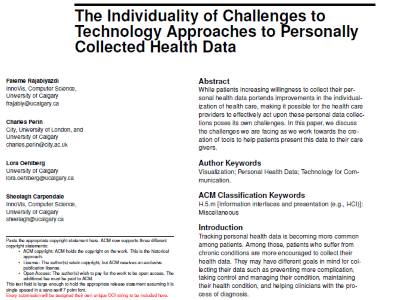
Fateme Rajabiyazdi, Charles Perin, Lora Oehlberg, Sheelagh Carpendale
Proceedings of the PervasiveHealth Workshop: Leveraging Patients Generated Data, May 2017, Barcelona, Spain
While patients increasing willingness to collect their personal health data portends improvements in the individualization of health care, making it possible for the health care providers to effectively act upon these personal data collections poses its own challenges. In this paper, we discuss the challenges we are facing as we work towards the creation of tools to help patients present this data to their care givers.
Exploring the Possibilities of Embedding Heterogeneous Data Attributes in Familiar Visualizations
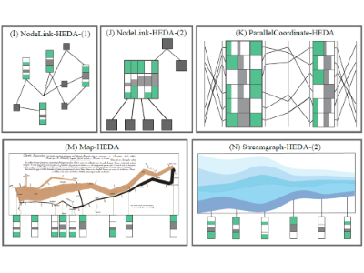
Mona Hosseinkhani Loorak, Charles Perin, Christopher Collins, Sheelagh Carpendale
IEEE Transactions on Visualization and Computer Graphics (TVCG / Proc. of Infovis '16). IEEE
Heterogeneous multi-dimensional data are now sufficiently common that they can be referred to as ubiquitous. The most frequent approach to visualizing these data has been to propose new visualizations for representing these data. These new solutions are often inventive but tend to be unfamiliar. We take a different approach. We explore the possibility of extending well-known and familiar visualizations through including Heterogeneous Embedded Data Attributes (HEDA) in order to make familiar visualizations more powerful. We demonstrate how HEDA is a generic, interactive visualization component that can extend common visualization techniques while respecting the structure of the familiar layout. HEDA is a tabular visualization building block that enables individuals to visually observe, explore, and query their familiar visualizations through manipulation of embedded multivariate data. We describe the design space of HEDA by exploring its application to familiar visualizations in the D3 gallery. We characterize these familiar visualizations by the extent to which HEDA can facilitate data queries based on attribute reordering.
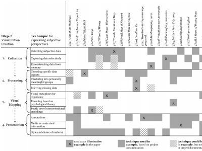
Subjectivity in Personal Storytelling with Visualization
Alice Thudt, Charles Perin, Wesley Willett, Sheelagh Carpendale
Information Design Journal. JBE
We explore visualization for personal storytelling and investigate techniques for communicating subjective experiences in personal visual narratives. Personal stories are often subjective and storytellers omit, invent, or embellish details to craft engaging stories or to communicate a perspective. As growing personal data collections allow individuals to leverage visualizations, we explore how personal visual narratives can express subjectivity. From an analysis of personal visualizations created by data enthusiasts, designers, and artists, we collect techniques for deliberately expressing subjectivity during data collection, processing, visual encoding, and presentation. Our results prompt a discussion about the role and potential of subjectivity in personal visual storytelling.
SDCurve.js: A JavaScript Library for Interactive Subdivision Curves
Richard Pusch, Charles Perin, Sheelagh Carpendale
IEEE VIS 2016 Electronic Conference Proceedings, Baltimore, MD, USA. IEEE
Fireflies: Expressive InfoVis Inspired by Biomimicry
Bon Adriel Aseniero, Charles Perin, Marjan Eggermont, Sheelagh Carpendale
IEEE VIS 2016 Arts Program demonstrations, Baltimore, MD, United States. IEEE
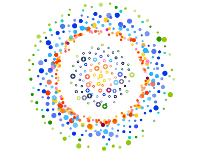
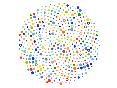
Fireflies is an exploration on how inspiration from nature can be leveraged in order to encode data into visual representations that enable curious exploration. In Fireflies, each data-point becomes a character—a firefly—expressing its aspects through visual variables such as motion and colour. Like swarming animals, fireflies can move across the visualization space, creating groups with other similar fireflies.
Fireflies: Biomimicry-Inspired InfoVis for Exploring Public Opinion about an Infectious Disease
Bon Adriel Aseniero, Charles Perin, Marjan Eggermont, Sheelagh Carpendale
IEEE VIS 2016 Electronic Conference Proceedings, Baltimore, MD, USA. IEEE
In groups, fireflies position themselves into beautiful phyllotactic patterns resembling how seeds grow within sunflower heads. We applied Fireflies to visualize data from a survey regarding Canadian's attitudes towards HIV/AIDS. Fireflies representing people express their discomfort towards HIV/AIDS through jittering motions. More jittering means greater discomfort. We also designed Fireflies to enable exploration for curiosity, thus, people are free to make their own groupings of fireflies based on a given parameter. This alludes to Metamorphoses where transformations are capricious, left in the whims of the gods. Consequently, the visualization becomes an ever changing spectacle of colours and motion.
Leveraging Biological Inspiration in an Information Visualization Class

Marjan Eggermont, Charles Perin, Bon Adriel Aseniero, Roxane Fallah, Sheelagh Carpendale
Proceedings of the IEEE VIS 2016 workshop: Pedagogy of Data Visualization, Baltimore, MD, USA
We reflect on an infovis course with a focus on biomimicry that we taught in Winter 2016. This graduate course looked beyond visualization basics and fundamentals and focused on the idea of making use of a biomimetic approach in visualization. As global interest in visualization expands, exciting new research is emerging in many facets of visualization. One of these new directions draws from the incredible successes in engineering, where improvements in many directions including form and functionality are resulting from leveraging the examples from biology, or biomimicry. The course was set in examples of advanced visualization topics so students with heterogeneous backgrounds could draw from multiple disciplines and implement visualization projects using bio-inspired design.
Slicing the Aurora
Sebastian Lay, Jo Vermeulen, Charles Perin, Eric Donovan, Raimund Dachselt, Sheelagh Carpendale
IEEE VIS 2016 Arts Program exhibit, Baltimore, MD, United States. IEEE
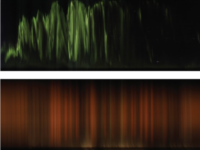
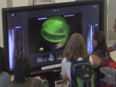
The Aurora Borealis or Northern Lights is a phenomenon that has fascinated people throughout history. The AuroraMAX outreach initiative provides a collection of time-lapse videos of the night sky captured by a camera at Yellowknife in Canada. We have generated large-scale digital prints from a sequence of photographs of the northern sky taken over the course of one night. Each image is aggregated across time creating visually appealing and intriguing images – or Keograms – that visualize Aurora Borealis (Northern Lights) activity as well as interesting movements of clouds and stars that occurred that night.
Slicing the Aurora: An Immersive Proxemics-Aware Visualization
Sebastian Lay, Jo Vermeulen, Charles Perin, Eric Donovan, Raimund Dachselt, Sheelagh Carpendale
Proceedings of the 2016 ACM Companion on Interactive Surfaces and Spaces, workshop on Immersive Analytics, Niagara Falls, ON, Canada. ACM
We presented some of these keograms at the IEEE VIS '16 Arts Program. We also created an interactive visualization of the Keograms that we exhibited at the local Beakerhead art-science festival. We report on the design of the interface and our experience in our ISS '16 Immersive Analytics workshop abstract.
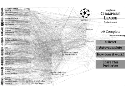
Sports Tournament Predictions Using Direct Manipulation
Romain Vuillemot, Charles Perin
IEEE Computer Graphics and Applications, Special issue on Sports Visualization. IEEE
We present an advanced interface for predicting sport tournaments by direct manipulation. The interface allows users to focus on their prediction tasks, by dragging and dropping teams to their final outcome in the competition, e. g., as winner or semi-finalist. This interface allows predictions to be made non-linearly, such as prediction winner first and filling up the other games. This better matches the way people actually make predictions, while the current interfaces can only be filled linearly, with text fields widgets as input. We released a first version of the interface for the 2014 FIFA soccer World Cup that validated the use of direct manipulation as alternative to widgets. We released an improved version a year later for the 2015/2016 UEFA soccer Champions League, which included a tracking system to understand users interactions. We recorded a total of 504; 307 interaction logs from 3; 029 unique visitors, among them 198 fully completed the prediction from scratch. From our analysis of logs, we provide a list of strategies that people employ to perform predictions, and which will help inform the design of further prediction interfaces that preserve the flow and concentration of users.
Using Gap Charts to Visualize the Temporal Evolution of Ranks and Scores
Charles Perin, Jeremy Boy, Frederic Vernier
IEEE Computer Graphics and Applications, Special issue on Sports Visualization. IEEE
Gap Charts are a novel class of line charts designed for visualizing the evolution of rankings over time, with a particular focus on sports data. Gap Charts show entries, e. g., teams participating in a competition, that are ranked over time according to a performance metric like a growing number of points or a score. The main advantages of Gap Charts are that 1) tied entries never overlap—only changes in rank generate limited overlap between time-steps; and 2) gaps between entries show the magnitude of their score difference. We evaluate the effectiveness of Gap Charts for performing different types of tasks, and find that they outperform standard time-dependent ranking visualizations for tasks that involve identifying and understanding evolutions in both ranks and scores. Finally, we show that Gap Charts are a generic and scalable class of line charts by applying them to a variety of different datasets.
Formalizing Emphasis in Information Visualization
Kyle Hall, Charles Perin, Peter Kusalik, Carl Gutwin, Sheelagh Carpendale
Computer Graphics Forum (CGF / Proc. of Eurovis '16 STAR reports). The Eurographics Association & John Wiley & Sons, Ltd
We provide a fresh look at the use and prevalence of emphasis effects in Infovis. Through a survey of existing emphasis frameworks, we extract a set-based approach that uses visual prominence to link visually and algorithmically diverse emphasis effects. Visual prominence provides a basis for describing, comparing and generating emphasis effects when combined with a set of general features of emphasis effects. Therefore, we use visual prominence and these general features to construct a new mathematical Framework for Information Visualization Emphasis, FIVE. The concepts we introduce to describe FIVE unite the emphasis literature and point to several new research directions for emphasis in information visualization.
Assessing the Readability of Stacked Graphs
Alice Thudt, Jagoda Walny, Charles Perin, Fateme Rajabiyazdi, Lindsay MacDonald, Riane Vardeleon, Saul Greenberg, Sheelagh Carpendale
Proceedings of the Graphics Interface Conference (GI 2016), Jun 2016, Victoria, BC, Canada. Canadian Information Processing Society
Stacked graphs are a visualization technique popular in casual scenarios for representing multiple time-series. Variations of stacked graphs have been focused on reducing the distortion of individual streams because foundational perceptual studies suggest that variably curved slopes may make it difficult to accurately read and compare values. We contribute to this discussion by formally comparing the relative readability of basic stacked area charts, ThemeRivers, streamgraphs and our own interactive technique for straightening baselines of individual streams in a ThemeRiver. We used both real-world and randomly generated datasets and covered tasks at the elementary, intermediate and overall information levels. Results indicate that the decreased distortion of the newer techniques does appear to improve their readability, with streamgraphs performing best for value comparison tasks. We also found that when a variety of tasks is expected to be performed, using the interactive version of the themeriver leads to more correctness at the cost of being slower for value comparison tasks.
Go and Grow: Mapping Personal Data to a Living Plant
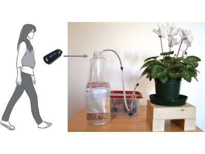
Fadi Botros, Charles Perin, Bon Adriel Aseniero, Sheelagh Carpendal
Proceedings of the International Working Conference on Advanced Visual Interfaces (AVI 2016), Jun 2016, Bari, Italy. ACM
Motivation is a key factor for introducing and maintaining healthy changes in behaviour. However, typical visualization methods (e.g., bar-, pie-, and line charts) hardly motivate individuals. We investigate how a plant - a living visualization - whose health relies on the plant owner's level of activity, can engage people in tracking and self-reflecting on their fitness data. To address this question, we designed, implemented, and studied Go & Grow, a living plant that receives water proportionally to its owner's activity. Our six-week qualitative study with ten participants suggests that living visualizations have qualities that their digital counterparts do not have. This includes people feeling: emotionally connected to their plant; sentiments such as pride and guilt; and responsibility towards their plant. Based on this study, we introduce the Goal Motivation Model, a model considering the diversity of individuals, thus supporting and encouraging a diversity of strategies for accomplishing goals.
Flexible Trees: Sketching Tree Layouts
Javad Sadeghi, Charles Perin, Tamara Flemisch, Mark Hancock, Sheelagh Carpendale
Proceedings of the International Working Conference on Advanced Visual Interfaces (AVI 2016), Jun 2016, Bari, Italy. ACM
Flexible Trees is a new sketch-based layout adjustment technique. Although numerous tree layout algorithms exist, these algorithms are usually bound to fit within standard shapes such as rectangles, circles and triangles. In order to provide the possibility of interactively customizing a tree layout, we offer a free-form sketch-based interaction through which one can re-define the boundary constraints for the tree layouts by combining ray-line intersection and line segment intersection. Flexible Trees offer topology preserving adjustments; can be used with a variety of tree layouts; and offer a simple way of authoring tree layouts for infographic purposes.
Involving Patients in their Care Plan from Clinicians' Perspective
Fateme Rajabiyazdi, Charles Perin, Julie Babione, Joseph Tropiano, Maria Santana, Jaime Kaufman, William Ghali, Peter Sargious, Sheelagh Carpendale
Proceedings of the CHI Workshop: WISH (Workshop on Interactive Systems in Healthcare), May 2016, San Jose, CA, USA. ACM
In this project, we relate the iterative fabrication of a physical Bertin Matrix. Jacques Bertin designed and refined such devices over 10 years (1970-1980) five iterations of what he called Dominos 1-5. For the purpose of an exhibit dedicated to Bertin's work during VIS 2014 in Paris, we designed an improved version of such device by leveraging modern fabrication possibilities and in particular a laser cutter. We describe the process, iterations and improvements of our matrix, and report lessons we learnt.
TimeSpan: Using Visualization to Explore Temporal Multi-Dimensional Data of Stroke Patients
Mona Hosseinkhani Loorak, Charles Perin, Naureen Kamal, Michael Hill, Sheelagh Carpendale
IEEE Transactions on Visualization and Computer Graphics (TVCG / Proc. of Infovis '15). IEEE
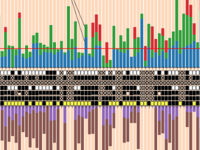
We present TimeSpan, an exploratory visualization tool designed to gain a better understanding of the temporal aspects of the stroke treatment process. Working with stroke experts, we seek to provide a tool to help improve outcomes for stroke victims. Time is of critical importance in the treatment of acute ischemic stroke patients. Every minute that the artery stays blocked, an estimated 1.9 million neurons and 12 km of myelinated axons are destroyed. Consequently, there is a critical need for efficiency of stroke treatment processes. Optimizing time to treatment requires a deep understanding of interval times. Stroke health care professionals must analyze the impact of procedures, events, and patient attributes on time—ultimately, to save lives and improve quality of life after stroke. First, we interviewed eight domain experts, and closely collaborated with two of them to inform the design of TimeSpan. We classify the analytical tasks which a visualization tool should support and extract design goals from the interviews and field observations. Based on these tasks and the understanding gained from the collaboration, we designed TimeSpan, a web-based tool for exploring multi-dimensional and temporal stroke data. We describe how TimeSpan incorporates factors from stacked bar graphs, line charts, histograms, and a matrix visualization to create an interactive hybrid view of temporal data. From feedback collected from domain experts in a focus group session, we reflect on the lessons we learned from abstracting the tasks and iteratively designing TimeSpan.
2016
2015
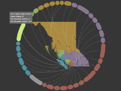
WEST: Visualizing non-Emergency Surgery Waiting Times
Fateme Rajabiyazdi, Charles Perin, Sheelagh Carpendale
IEEE VIS 2015 Electronic Conference Proceedings, Chicago, IL, USA. IEEE
WESt is a visualization for surgery waiting times applied to the province of British Columbia (BC) in Canada. This project is motivated by the long waiting time for surgeries in BC, which has the potential to put patients in danger and put extra pressure on clinicians [2]. WESt helps patients select a hospital and a physician, and to explore their options to get their surgery as soon as possible.
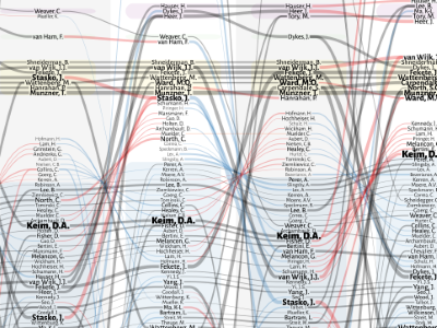
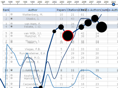
Who Rules Infovis? Unwrapping the Conference Organization
Charles Perin, Sheelagh Carpendale
IEEE VIS 2015 Electronic Conference Proceedings, Chicago, IL, USA. IEEE
Members understanding the organization of a community is useful for any community. Correspondingly this applies to researchers involved in the Infovis community. We present Who Rules Infovis?, a visualization designed to be a static infographic showing the temporal evolution of the internal organization of the Infovis conference track. It shows all persons who have been a chair or in a related committee over the past 20 years and makes it more possible to understand the internal organization of the community.
Crossets: Manipulating Multiple Sliders by Crossing

Charles Perin, Pierre Dragicevic, Jean-Daniel Fekete
Proceedings of the Graphics Interface Conference (GI 2015), Jun 2015, Halifax, NS, Canada. Canadian Information Processing Society
Crossets are new interactive instruments or widgets based on crossing gestures that exploit the dimension orthogonal to sliders' axes for manipulating multiple aligned sliders simultaneously. We propose a Crossets taxonomy to generalize the sliders’ properties to those of other standard widgets. We introduce and illustrate the constrained crossing gesture with Crossets in an interface for the visual exploration of numerical tables. We discuss alternative strategies to Crossets before exploring persistent unconstrained crossing gestures compatible with Crossets, introducing Spline as a persistent reusable interactive instrument. This paper highlights promising perspectives for crossing-based widgets. We hope future interfaces will make use of this simple technique that can help improve the efficiency of standard widgets and lead to the generation of new styles of interfaces.
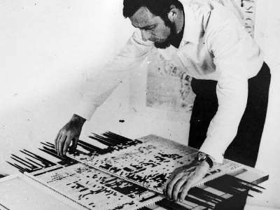
DIY Bertin Matrix
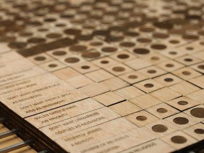
Charles Perin, Mathieu Le Goc, Romain Di Vozzo, Jean-Daniel Fekete, Pierre Dragicevic
Proceedings of the CHI Workshop: Exploring the Challenges of Making Data Physical, Apr 2015, Seoul, Republic of Korea. ACM
In this project, we relate the iterative fabrication of a physical Bertin Matrix. Jacques Bertin designed and refined such devices over 10 years (1970-1980) five iterations of what he called Dominos 1-5. For the purpose of an exhibit dedicated to Bertin's work during VIS 2014 in Paris, we designed an improved version of such device by leveraging modern fabrication possibilities and in particular a laser cutter. We describe the process, iterations and improvements of our matrix, and report lessons we learnt.
Investigating the Direct Manipulation of Ranking Tables for Time Navigation
Romain Vuillemot, Charles Perin
Proceedings of the CHI Workshop: Exploring the Challenges of Making Data Physical, Apr 2015, Seoul, Republic of Korea. ACM
We introduce a novel time navigation technique to update ranking tables by direct manipulation. The technique allows users to drag a table's cells to change the time period, while a line chart overlays on top of the table to provide an overview of the changes. The line chart is also a visual hint to control the pace at which data are updated. We explore the design and usability of this technique for table variations in size, time spans and data variability. We report the results of a usability study, using academic citation rankings and economic complexity datasets, and discuss design implications coming with real-world scenarios such as missing data and affordance.
2014
Direct Manipulation for Information Visualization
Charles Perin
PhD dissertation, Université Paris-Sud - Paris XI, Nov. 2014
There is a tremendous effort from the Information Visualization (Infovis) community to design novel, more efficient or more specialized desktop visualization techniques. While visual representations and interactions are combined to create these visualizations, less effort is invested in the design of new interaction techniques for Infovis. In this thesis, I focus on interaction for Infovis and explore how to improve existing visualization techniques through efficient yet simple interactions. To become more efficient, the interaction techniques should reach beyond the standard widgets and Window/Icon/Menu/Pointer (WIMP) user interfaces. In this thesis, I argue that the design of novel interactions for visualization should be based on the direct manipulation paradigm and the instrumental interaction framework, and take inspiration from advanced interactions investigated in HCI research but not well exploited yet in Infovis. I extract from the HCI literature a large set of principles, benefits and challenges of direct manipulation interfaces that have been proposed and discussed over the last 30 years, that I classify into three high level overlapping categories: Learning, Ease of use, and Seamless and fluid interaction. Then I describe and evaluate several exemplar visualization techniques according to these criteria. I describe multiple projects I have designed based on these principles and benefits, to tackle direct manipulation challenges, illustrating how opportunistic interactions can empower visualizations. I explore design implications raised by novel interaction techniques, such as the tradeoff between cognitive congruence (the natural mapping between user's intent and action) and versatility (of the interaction techniques), the problem of engaging interaction (how to make the user engaged and willing to explore the visualization), and the benefits of seamless, fluid interaction. Finally, I provide design guidelines and perspectives, addressing the grand challenge of building or consolidating the theory of interaction for Infovis.
Le Tour de France 2014 at a Glance
Charles Perin, Jeremy Boy, Frederic Vernier
IEEE VGTC International Data-Visualization Contest, VIS 2014, Paris, France
Gap Charts are a novel class of line charts designed for visualizing the evolution of rankings over time, with a particular focus on sports data. Gap Charts show entries, e. g., teams participating in a competition, that are ranked over time according to a performance metric like a growing number of points or a score. The main advantages of Gap Charts are that 1) tied entries never overlap—only changes in rank generate limited overlap between time-steps; and 2) gaps between entries show the magnitude of their score difference. We evaluate the effectiveness of Gap Charts for performing different types of tasks, and find that they outperform standard time-dependent ranking visualizations for tasks that involve identifying and understanding evolutions in both ranks and scores. Finally, we show that Gap Charts are a generic and scalable class of line charts by applying them to a variety of different datasets.
Bertifier: New Interactions for Crafting Tabular Visualizations
Charles Perin, Pierre Dragicevic, Jean-Daniel Fekete
Extended Abstracts and Demonstrations at the French Speaking Conference on Human-Computer Interaction (IHM 2014), Oct 2014, Lille, France. ACM
Bertifier is a Web app for rapidly creating tabular visualizations from spreadsheets. It directly draws from Jacques Bertin’s matrix analysis method, whose goal was to “simplify without destroying” by encoding cell values visually and grouping similar rows and columns. Bertifier has the potential to bring Bertin’s method to a wide audience of both technical and non-technical users, and empower them with data analysis and communication tools that were so far only accessible to a handful of specialists. www.aviz.fr/Bertifier contains additional material materials, a tutorial, and a link to the online open-source application.
Manipulation de Sliders Multiples par Franchissement
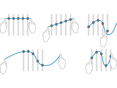
Charles Perin, Pierre Dragicevic, Jean-Daniel Fekete
Proceedings of the French Speaking Conference on Human-Computer Interaction (IHM 2014), Oct 2014, Lille, France. ACM
Crossets are new interactive instruments or widgets based on crossing gestures that exploit the dimension orthogonal to sliders' axes for manipulating multiple aligned sliders simultaneously. We propose a Crossets taxonomy to generalize the sliders’ properties to those of other standard widgets. We introduce and illustrate the constrained crossing gesture with Crossets in an interface for the visual exploration of numerical tables. We discuss alternative strategies to Crossets before exploring persistent unconstrained crossing gestures compatible with Crossets, introducing Spline as a persistent reusable interactive instrument. This paper highlights promising perspectives for crossing-based widgets. We hope future interfaces will make use of this simple technique that can help improve the efficiency of standard widgets and lead to the generation of new styles of interfaces.
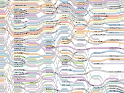
À Table! Improving Temporal Navigation in Soccer Ranking Tables
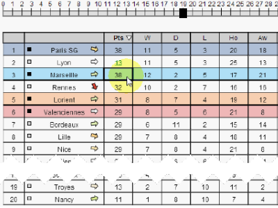
Charles Perin, Romain Vuillemot, Jean-Daniel Fekete
Proceedings of the SIGCHI Conference on Human Factors in Computing Systems (CHI 2014), Apr 2014, Toronto, ON, Canada. ACM
À Table! is an enhanced soccer ranking table to improve temporal navigation, by combining two novel interaction techniques. Ranking tables order soccer teams as rows, and columns contain e. g., their points or number of scored goals. Because they are a snapshot of a championship at a time t, they are constantly updated with new results. Such updates change the rows vertical order, which makes the tracking of a team, over time, difficult. We observed that current tables on the web do not support such changes very well, are generally hard to read, and lack dynamic interactions. This contrasts with the extensive use of temporal trends by soccer analysts in articles. We introduce two interactive techniques to better explore time: DRAG-CELL is based on direct manipulation of values to browse ranks; VIZ-RANK uses a transient line chart of team ranks to visually explore a championship. An on-line evaluation with 143 participants shows that each technique efficiently supports a set of temporal tasks, not supported by current ranking tables, while not breaking the flow of users. This paves the way for efficiently introducing advanced visual exploration techniques to millions of soccer enthusiasts who use tables everyday, as well as other application domains which use ranking tables.
Expert Player Interface Design: Preserving the Flow
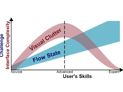
Charles Perin
Proceedings of the CHI Workshop: Player Experience: Mixed Methods and Reporting Results, Apr 2014, Toronto, Canada. ACM
The theory of flow is prominent in game design. However, designing the user interface that will satisfy all players and preserve their state of flow is impossible for complex, multi-class oriented games such as World of Warcraft. Based on how players re-arrange the interface according to their own level of expertise, I propose an extension to the flow model by correlating interface complexity with both user experience and user expertise.
Revisiting Bertin Matrices: New Interactions for Crafting Tabular Visualizations
Charles Perin, Pierre Dragicevic, Jean-Daniel Fekete
IEEE Transactions on Visualization and Computer Graphics (TVCG / Proc. of Infovis '14). IEEE
We present BERTIFIER, a web app for rapidly creating tabular visualizations from spreadsheets. BERTIFIER draws from Jacques Bertin's matrix analysis method, whose goal was to "simplify without destroying" by encoding cell values visually and grouping similar rows and columns. Although there were several attempts to bring this method to computers, no implementation exists today that is both exhaustive and accessible to a large audience. BERTIFIER remains faithful to Bertin's method while leveraging the power of today's interactive computers. Tables are formatted and manipulated through crossets, a new interaction technique for rapidly applying operations on rows and columns. We also introduce visual reordering, a semi-interactive reordering approach that lets users apply and tune automatic reordering algorithms in a WYSIWYG manner. Sessions with eight users from different backgrounds suggest that BERTIFIER has the potential to bring Bertin's method to a wider audience of both technical and non-technical users, and empower them with data analysis and communication tools that were so far only accessible to a handful of specialists.
2013
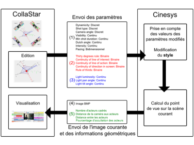
CollaStar: Interaction collaborative avec des données multidimensionnelles et temporelles
Charles Perin, Marc Christie, Frederic Vernier, Christophe Lino
Proceedings of the French Speaking Conference on Human-Computer Interaction (IHM 2013), Nov 2013, Bordeaux, France. ACM
CollaStar is an interface for interactive and collaborative manipulation of multidimensional parameters that evolve over time. While a number of representations have been proposed in the literature to visualize multidimensional and temporal data, only a few techniques address the issue of controlling the values of such data over time. CollaStar embeds meaningful interaction techniques in a collaborative context, to allow users to work together by manipulating a range of time-varying parameters. The interface is composed of an extended Linear Wall representation to access the prior manipulated data together with an interactive star plot representation for collaborative manipulation. We evaluate the applicability of the CollaStar model on a simple task, and further link the model to CineSys, an interactive cinematographic system which supports the creation of 3D cinematics through a range of high-level control parameters. Preliminary feedback highlight the potential of the approach.
Real-Time Crowdsourcing of Detailed Soccer Data
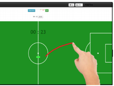
Charles Perin, Romain Vuillemot, Jean-Daniel Fekete
Proceedings of the IEEE VIS 2013 workshop: What's the score? The 1st Workshop on Sports Data Visualization, Atlanta, GA, USA
We explore how spectators of a live soccer game can collect detailed data while watching the game. Our motivation arouse from the lack of free detailed sport data, contrasting with the large amount of simple statistics collected for every popular games and available on the web. Assuming many spectators carry a smart phone during a game, we implemented a series of input interfaces for collecting data in real time. In a user study, we asked participants to use those interfaces to perform tracking tasks such as locating players in the field, qualifying ball passes, and naming the player with ball while watching a video clip of a real soccer game. Our two main results are 1) the crowd can collect detailed–and fairly complex–data in real-time with reasonable quality while each participant is assigned a simple task, and 2) a set of design implications for crowd-powered interfaces to collect live sport data. We also discuss the use of such data into a system we developed to visualize soccer phases, and the design implications coming with the visual communication of missing and uncertain detailed data.
Illustrative Data Graphics in 18th-19th Century Style: A Case Study
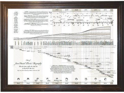
Benjamin Bach, Pierre Dragicevic, Samuel Huron, Petra Isenberg, Yvonne Jansen, Charles Perin, Andre Spritzer, Romain Vuillemot, Wesley Willett, Tobias Isenberg
IEEE VIS 2013 Electronic Conference Proceedings, Atlanta, GA, USA. IEEE
The well-known historic hand-made visualizations that were created in the 18th and 19th centuries by artists such as Charles Joseph Minard, William Playfair, Joseph Priestley, and Florence Nightingale have long been a great source of inspiration for contemporary visualization work. Tufte, in particular, praises much of this early work—such as Napoleon's march—for its graphical excellency but also its aesthetic, elegance, and technique. The specific style of the early graphics arose from a combination of hand-crafted appearance, clear and clean graphic design, precise data depiction, coupled with a storytelling layout.
Visual Showcase: An Illustrative Data Graphics in 18th-19th Century Style
Pierre Dragicevic, Benjamin Bach, Nicole Dufournaud, Samuel Huron, Petra Isenberg, Yvonne Jansen, Charles Perin, Andre Spritzer, Romain Vuillemot, Wesley Willett, Tobias Isenberg
Visual Showcase at the Joint ACM/EG Symposium on Computational Aesthetics, Sketch-Based Interfaces and Modeling, and Non-Photorealistic Animation and Rendering (Expressive), Anaheim, CA, USA
We present a case study in which we attempted to imitate the graphical appeal of historic infographics. Our goal was to emulate, in particular, the hand-crafted style and aesthetic for a modern personal data graphic that shows the historic evolution of research activities from the perspective of our team leader. We provide details on the type of data we chose to tell his story and how we emulated the style of historic data engravings to create a unique present on the occasion of his 50th birthday. The graphic was well received and is now permanently being exhibited.
R2S2: A Hybrid Technique to Visualize Sport Ranking Evolution
Charles Perin, Frederic Vernier
Proceedings of the IEEE VIS 2013 workshop: What's the score? The 1st Workshop on Sports Data Visualization, Atlanta, GA, USA
Gap Charts are a novel class of line charts designed for visualizing the evolution of rankings over time, with a particular focus on sports data. Gap Charts show entries, e. g., teams participating in a competition, that are ranked over time according to a performance metric like a growing number of points or a score. The main advantages of Gap Charts are that 1) tied entries never overlap—only changes in rank generate limited overlap between time-steps; and 2) gaps between entries show the magnitude of their score difference. We evaluate the effectiveness of Gap Charts for performing different types of tasks, and find that they outperform standard time-dependent ranking visualizations for tasks that involve identifying and understanding evolutions in both ranks and scores. Finally, we show that Gap Charts are a generic and scalable class of line charts by applying them to a variety of different datasets.
CinemAviz
Charles Perin
Proceedings of the IEEE VIS VAST Challenge, Atlanta, GA, USA
CinemAviz is a visualization tool for the exploration of the Imdb database. It consists of a variant of a scatterplot matrix - with different cell views - and a prediction panel to estimate the user rating and opening week box office of released movies.
Interactive Horizon Graphs: Improving the Compact Visualization of Multiple Time Series
Charles Perin, Frederic Vernier, Jean-Daniel Fekete
Proceedings of the SIGCHI Conference on Human Factors in Computing Systems (CHI 2013), Apr 2013, Paris, France. ACM
Many approaches have been proposed for the visualization of multiple time series. Two prominent approaches are reduced line charts (RLC), which display small multiples for time series, and the more recent horizon graphs (HG). We propose to unify RLC and HG using a new technique—interactive horizon graphs (IHG)— which uses pan and zoom interaction to increase the number of time series that can be analysed in parallel. In a user study we compared RLC, HG, and IHG across several tasks and numbers of time series, focusing on datasets with both large scale and small scale variations. Our results show that IHG outperform the other two techniques in complex comparison and matching tasks where the number of charts is large. In the hardest task IHG have a significantly higher number of good answers (correctness) than HG (+14%) and RLC (+51%) and a lower error magnitude than HG (-64%) and RLC (-86%).
SoccerStories: A Kick-off for Visual Soccer Analysis
Charles Perin, Romain Vuillemot, Jean-Daniel Fekete
IEEE Transactions on Visualization and Computer Graphics (TVCG / Proc. of Infovis '13). IEEE
SoccerStories is a visualization interface to support analysts in exploring soccer data and communicating interesting insights. Currently, most analyses on such data relate to statistics on individual players or teams. However, soccer analysts we collaborated with consider that quantitative analysis alone does not convey the right picture of the game, as context, player positions and phases of player actions are the most relevant aspects. We designed SoccerStories to support the current practice of soccer analysts and to enrich it, both in the analysis and communication stages. Our system provides an overview+detail interface of game phases, and their aggregation into a series of connected visualizations, each visualization being tailored for actions such as a series of passes or a goal attempt. To evaluate our tool, we ran two qualitative user studies on recent games using SoccerStories with data from one of the world's leading live sports data providers. The first study resulted in a series of four articles on soccer tactics, by a tactics analyst, who said he would not have been able to write these otherwise. The second study consisted in an exploratory follow-up to investigate design alternatives for embedding soccer phases into word-sized graphics. For both experiments, we received a very enthusiastic feedback and participants consider further use of SoccerStories to enhance their current workflow.
2012
Progressive Horizon Graphs: Improving Small Multiples Visualization of Time Series
Charles Perin, Frederic Vernier, Jean-Daniel Fekete
IEEE VIS 2012 Electronic Conference Proceedings, Seattle, WA, USA. IEEE
Many approaches have been proposed for the visualization of multiple time series. Two prominent approaches are reduced line charts (RLC), which display small multiples for time series, and the more recent horizon graphs (HG). We propose to unify RLC and HG using a new technique—interactive horizon graphs (IHG)— which uses pan and zoom interaction to increase the number of time series that can be analysed in parallel. In a user study we compared RLC, HG, and IHG across several tasks and numbers of time series, focusing on datasets with both large scale and small scale variations. Our results show that IHG outperform the other two techniques in complex comparison and matching tasks where the number of charts is large. In the hardest task IHG have a significantly higher number of good answers (correctness) than HG (+14%) and RLC (+51%) and a lower error magnitude than HG (-64%) and RLC (-86%).
2011
Contrôle multidimensionnel interactif et application à l'édition de contenus cinématographiques virtuels
Charles Perin
MSc thesis, Université Rennes 1, Sep. 2011
CollaStar is an interface for interactive and collaborative manipulation of multidimensional parameters that evolve over time. While a number of representations have been proposed in the literature to visualize multidimensional and temporal data, only a few techniques address the issue of controlling the values of such data over time. CollaStar embeds meaningful interaction techniques in a collaborative context, to allow users to work together by manipulating a range of time-varying parameters. The interface is composed of an extended Linear Wall representation to access the prior manipulated data together with an interactive star plot representation for collaborative manipulation. We evaluate the applicability of the CollaStar model on a simple task, and further link the model to CineSys, an interactive cinematographic system which supports the creation of 3D cinematics through a range of high-level control parameters. Preliminary feedback highlight the potential of the approach.